|
Getting your Trinity Audio player ready... |
If you’ve been following my WCAG series, you should already know the four foundational principles of accessibility: Perceivable, Operable, Understandable, and Robust, better known as the POUR principles (Missed that part? Catch up here).
But we’re not stopping at theory. The POUR principles break down into 13 actionable WCAG guidelines, your playbook for making real accessibility happen. While they’re not testable on their own, they’re what you should be aiming for to nail the user experience for all.
Key Points to Keep in Mind:
Blueprint for Action: The WCAG guidelines give you a clear roadmap to meet accessibility standards, showing what success looks like and how to achieve it. Applied correctly, they make your e-commerce store easier to navigate, reduce checkout friction, and ensure every customer can interact with your site seamlessly.
Not Testable by Themselves: You won’t be running automated tests directly on the guidelines. Think of them as your strategy map, they guide your decisions so every tweak, from product filters to checkout forms, actually improves accessibility.
Covers All Bases: These guidelines account for a wide range of disabilities, assistive technologies, and user behaviours. That means whether someone is using a screen reader, voice commands, or keyboard navigation, your site still works, no lost customers, no abandoned carts.
Let’s break down the 13 WCAG guidelines into bite-sized, actionable pieces. Whether you’re running a small shop or a large e-commerce platform, these guidelines will keep your digital experience smooth, inclusive, and conversion-friendly.
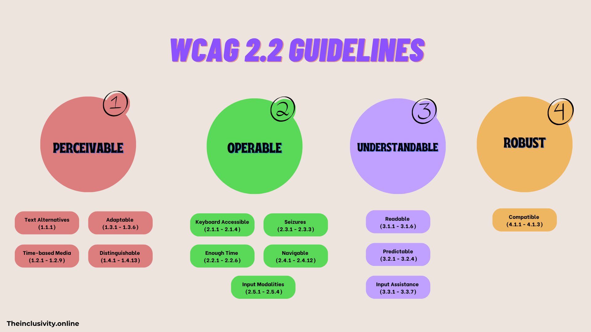
Perceivable Guidelines
When we say “perceivable,” we mean making sure that all users can see, hear, and understand the info on your site( but you already know what). If someone can’t perceive your content, they can’t interact with it. The guidelines here ensure your content works for users with sensory impairments, so no one’s left in the dark.
1. Text Alternatives (1.1.1)
The Goal: Provide alternatives for non-text content.
Why It Matters: Users with visual impairments rely on alt text or descriptions to access images, videos, and other non-text content. Without them, they miss out on your product details or key messaging.
E-commerce tip: Use Shopify, WordPress, or WooCommerce’s built-in alt text fields. Screen reader testing can be done with NVDA or VoiceOver.
Pro Tip: Keep alt text concise, don’t overdo it with unnecessary keywords, and there’s no need to include phrases like “image of” or “picture of.” Focus on making it meaningful for screen reader users.
2. Time-based Media (1.2.1 – 1.2.9)
The Goal: Offer alternatives for audio and video content.
Why It Matters: Users with hearing impairments need captions, while visually impaired users may need audio descriptions. Video product demos, tutorials, and ads must be accessible.
Example: Caption product demo videos, include transcripts for audio-only content, like podcasts or webinars.
E-commerce tip: Include product highlights in captions to help shoppers who watch muted videos.
Pro Tools: Amara, Kapwing, or Descript make captioning easy. Captions also boost SEO and engagement.
3. Adaptable (1.3.1 – 1.3.6)
The Goal: Ensure content can be presented in different ways without losing its meaning.
Why It Matters: Users interact differently, zooming in, switching devices, or using screen readers. Your layout must stay intact.
Example: Responsive product pages that adapt to mobile, tablet, and desktop. Users with magnifiers or zoom features still see product details correctly.
E-commerce tip: Test checkout forms and product filters on different screen sizes to avoid barriers that reduce conversions.
Pro Tip: BrowserStack or LambdaTest for multi-device testing.
4. Distinguishable (1.4.1 – 1.4.13)
The Goal: Make it easier for users to see and hear content.
Why It Matters: Strong contrast and clear audio controls are essential for users with low vision or hearing impairments. Poor contrast or tiny controls create friction that drives shoppers away.
Example: Dark text on a light background, captions for product videos, high-contrast buttons for calls to action.
E-commerce tip: Make sure CTAs like “Add to Cart” and “Buy Now” stand out visually, so every user can find them easily.
Pro Tools: WebAIM Contrast Checker, Stark plugin for Figma.
Operable Guidelines
This is all about making sure users can interact with your site—whether they’re using a keyboard, mouse, touchscreen, or assistive tech. It’s not enough for content to be perceivable; your checkout, filters, and product pages need to
5. Keyboard Accessible (2.1.1 – 2.1.4)
The Goal: Ensure all functionality is available via a keyboard.
Why It Matters: Users with motor impairments may rely on keyboards or alternative input devices. If menus, links, or product filters aren’t keyboard-friendly, they can’t shop.
Example: Users must be able to navigate your site’s menu, product grids, and checkout forms using only the keyboard.
E-commerce tip: Test adding items to the cart and proceeding through checkout without a mouse; if it breaks, you’re losing sales.
Pro Tools: NVDA, VoiceOver, and ChromeVox for testing.
6. Enough Time (2.2.1 – 2.2.6)
The Goal: Provide users with enough time to read and interact with content.
Why It Matters: Cognitive or motor impairments can slow down form completion, checkout, or reading product info. Strict timers frustrate users and increase cart abandonment.
Example: Instead of setting a strict time limit on a form, give users the option to extend the time or disable it entirely.
E-commerce tip: On checkout pages, ensure session timeouts warn users or allow extensions to prevent lost sales.
Pro Tools: Tota11y can highlight time-based interactions that need adjustments.
7. Seizures and Physical Reactions (2.3.1 – 2.3.3)
The Goal: Avoid content that could trigger seizures or physical reactions.
Why It Matters: Flashing or blinking elements can harm users with photosensitive epilepsy or cause discomfort for others.
Example: Avoid flashing banners or animations that blink more than three times per second.
E-commerce tip: Limit flashy promos or “hot deals” banners; use subtle animations that highlight products without risks.
Pro Tools: Tools like Trace can analyze your site for any flashing elements that might pose a risk.
8. Navigable (2.4.1 – 2.4.12)
The Goal: Help users move through your site and find content.
Why It Matters: Users need intuitive pathways and consistent navigation to move through your site without confusion, especially those with cognitive disabilities.
Example: Create clear headers, use breadcrumb trails, and provide skip-to-content links so users can easily jump past repetitive navigation.
E-commerce tip: Make sure users can quickly find product categories, filters, and checkout links without confusion.
Pro Tools: WAVE or Axe Accessibility Checker can identify navigation issues.
9. Input Modalities (2.5.1 – 2.5.4)
The Goal: Make it easier for users to operate your site with various input methods like voice, touch, or gestures.
Why It Matters: Not everyone uses a mouse. Some may use voice commands, touchscreens, or assistive technology.
Example: Ensure touch targets (like buttons) are large enough and that voice commands can operate your site smoothly.
E-commerce tip: Ensure “Add to Cart” and “Checkout” buttons are easy to hit on mobile and voice-enabled devices.
Pro Tip: Test using tools like Google Voice Access to see how voice commands work with your site.
Understandable Guidelines
Now we’re into Understandable, this part is all about making sure your content is clear and functions in a predictable way. Users should be able to comprehend your content and know how to interact with it without any unexpected surprises.
10. Readable (3.1.1 – 3.1.6)
The Goal: Make text content clear and easy to understand.
Why It Matters: Simple, well-structured language helps users of all literacy levels and those with cognitive disabilities. Confusing product descriptions or technical jargon can kill conversions.
Example: Break product info into short paragraphs, bullet key features, and avoid overly technical terms.
E-commerce tip: Ensure product instructions, sizing guides, and checkout info are instantly clear, don’t force users to guess.
Pro Tools: Run your content through tools like Hemingway App or Readable.com to check readability.
11. Predictable (3.2.1 – 3.2.4)
The Goal: Ensure your website behaves in predictable ways.
Why It Matters: Consistent layout, navigation, and interactions prevent confusion and improve trust, critical for online shopping.
Example: Keep your website’s layout, buttons, and navigation the same across all pages so users know what to expect.
E-commerce tip: Avoid surprise popups, moving banners, or shifting buttons that could frustrate shoppers.
Pro Tip: Conduct usability testing with real users or use Maze to simulate flows.
12. Input Assistance (3.3.1 – 3.3.7)
The Goal: Help users avoid and correct mistakes.
Why It Matters: Clear instructions and error messages reduce frustration, especially on checkout forms or sign-up flows.
Example: If a user misses a required field in a form, provide immediate feedback highlighting the mistake and how to fix it.
E-commerce tip: Make forms forgiving, don’t force users to re-enter all info if one field fails.
Pro Tools: Deque Axe, WAVE form validation, or Lighthouse accessibility audits.
Robust Guidelines
This is about making sure your content is compatible with different technologies and remains accessible as those technologies evolve.
13. Compatible (4.1.1 – 4.1.3)
The Goal: Maximize compatibility with current and future technologies.
Why It Matters: Users rely on different browsers, devices, and assistive tech. Clean, standards-compliant code ensures your content remains accessible as technology evolves.
Example: Ensure your HTML is clean, error-free, and compliant with accessibility standards, so it works well with screen readers and other assistive tools.
E-commerce tip: Check product grids, checkout forms, and interactive filters on multiple devices and browsers; don’t lose sales to a technical glitch.
Pro Tools: BrowserStack, NVDA, VoiceOver, ChromeVox for multi-device checks.
Wrapping Up
The 13 WCAG guidelines give you a clear roadmap for making your website accessible, usable, and enjoyable for everyone, shoppers included. Following them doesn’t just keep you compliant; it reduces friction, keeps carts full, and turns casual visitors into loyal customers.
Even small fixes might seem minor to you, but for someone who previously faced barriers, you’re giving freedom, confidence, and a sense of accomplishment. You’re creating spaces where people don’t just complete a purchase, they can fully enjoy and engage with your site, enhancing their digital experience. These thoughtful changes can also have a measurable impact on conversions, making accessibility a win for both users and your business.
Next, I’ll break down each Success Criterion for these guidelines. See you there!