|
Getting your Trinity Audio player ready... |
Alright, imagine you’re designing a new product, you’ve got your target audience in mind, and everything’s going great until you realize that your design isn’t accessible for people with disabilities. So, what happens next? You scramble to add accessibility features, increasing costs and often compromising the overall design. Sound familiar?
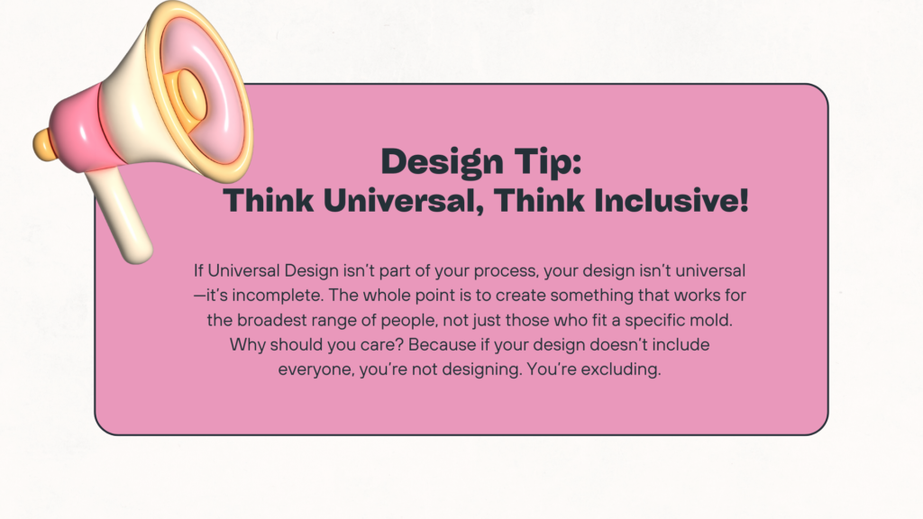
This is where Universal Design swoops in. Rather than treating accessibility as an afterthought, Universal Design incorporates it from the start. The result? A product that’s usable by a broad spectrum of people, without the need for any awkward or expensive add-ons. This approach isn’t just about accommodating everyone, it’s about making life easier for everyone.
The Curb Cut Effect
You’ve probably noticed those gentle slopes at the edges of sidewalks, curb cuts. Originally designed for wheelchair users, they now benefit a wide range of people: parents with strollers, delivery workers with carts, and even kids on bikes. That’s Universal Design in action.
Now, let’s translate these principles into the digital world and see how we can design online experiences that are as inclusive as those curb cuts.
The Seven Principles of Universal Design
So, what does Universal Design look like in practice? These seven key principles, crafted by Ron Mace and his team of experts from fields like architecture, usability research, and industrial design, apply to everything from physical spaces to digital products. Let’s take a closer look at each one.
1. Equitable Use: Same Experience for Everyone
This one’s all about fairness. Everyone should have the same access to electronic information, regardless of their abilities. This means designing interfaces that are intuitive and attractive for all.
For example, individuals with motor disabilities should be able to navigate content solely with a keyboard, while those who are blind should be able to use screen readers effectively. It also means ensuring that people with low vision can customize the styling of content and that deaf or partial hearing loss users have access to synchronized captions for video content. In essence, it’s about making sure no one is left out.
👍 Do this:
- Ensure your website is fully navigable using just a keyboard. Implement clear tabbing order and use ARIA landmarks to guide users.
👎 Don’t do this:
- Don’t make your site a mouse-only club. A website that requires precise mouse movements without keyboard alternatives leaves out users who can’t or don’t use a mouse.
2. Flexibility in Use: Adaptability is Key
This principle is all about allowing users to interact with your content in a way that suits them best. Users should be able to access content using a wide variety of devices and not be penalized for lacking pinpoint accuracy.
Can your design adapt to different user preferences and abilities? People approach tasks differently based on their needs, some may need larger text, while others might need voice navigation. Flexibility is key to making sure everyone can interact with your product their way. Your design should adapt to the user, not the other way around.
👍 Do this:
- Provide multiple input methods: Let users interact with your content through a variety of devices, whether it’s a keyboard, a mouse, touch, or voice commands. This flexibility ensures that users can engage with your content using tools that work best for their abilities and preferences.
- Design for customizations: Allow users to adjust text size, change color contrast, or switch to high-contrast modes for better visibility. Features like customizable layouts and alternative ways to interact with controls make the experience more inclusive for everyone.
👎 Don’t do this:
- Don’t rely on one method of input: Avoid designing interfaces that only respond to mouse clicks or touch gestures. This can create barriers for users who rely on assistive technologies like screen readers or voice commands.
3. Simple and Intuitive Use: Keep It Clear
This principle is all about making designs that are easy to understand, no matter the user’s experience level. For people with learning or reading disabilities, clear instructions and consistent design can make all the difference. It’s not just about accessibility, it’s about making the experience less stressful and more enjoyable for everyone. Whether it’s a detailed guide or a simple button label, clarity should always be at the forefront.
👍 Do this:
- Use simple language and clear, concise instructions. For instance, instead of saying “Authenticate your credentials,” you could say, “Please sign in with your username and password.”
👎 Don’t do this:
- Avoid using jargon or complicated instructions. A button labeled “Proceed to Next Iteration” is less intuitive than “Next” or “Continue.”
4. Perceptible Information: Multiple Modes, Clear Focus
Here the principle is all about making sure everyone can access essential information, no matter how they’re consuming it. It’s all about providing multiple modes of presentation for essential information, think video content with synchronized captions, or text that’s both visually distinct and logically separated.
The goal is to ensure that all users, regardless of their abilities, can easily perceive and understand the content. This is crucial not just for people with disabilities but for anyone who might be distracted or multitasking.
👍 Do this:
- Subtitles aren’t just for foreign films. Provide captions for video content, ensure a high contrast against the background, and make sure there’s enough spacing between elements.
👎 Don’t do this:
- Don’t rely solely on colour to convey information. A form that uses red text alone to indicate errors may be invisible to someone who’s colourblind. Instead, pair colours with icons or text explanations.
5. Tolerance for Error: Built-In Safety Nets
Nobody’s perfect, and that’s okay! This principle is about designing with forgiveness in mind, letting users make mistakes without ruining their experience.
Your design should anticipate potential errors and allow users to correct them easily. This is especially important for individuals with cognitive disabilities or those prone to accidental interactions due to limited motor skills. And when alerts do pop up, they should be easy to find and understand, even for users relying on assistive technologies.
👍 Do this:
- Use confirmation dialogs before performing critical actions, like deleting an account. An “Are you sure?” prompt helps prevent accidental deletions – It’s like having a safety net for those “oops” moments.
👎 Don’t do this:
- Avoid “one and done” actions. A “Delete” button without an undo option can cause anxiety and frustration, especially for users with cognitive disabilities.
6. Low Physical Effort: Make It Easy
Accessibility shouldn’t feel like a workout. This principle emphasizes designing with minimal physical and cognitive effort in mind. For users, this could mean reducing the number of steps to complete a task or making sure interactive elements are easy to engage with. Remember, even something as simple as standardizing keyboard shortcuts can significantly reduce the effort required.
👍 Do this:
- Design with comfort in mind. Use straightforward navigation paths and minimize the number of clicks needed to complete actions. For example, offer shortcuts for frequent tasks.
👎 Don’t do this:
- Don’t make users jump through hoops. Avoid processes that require unnecessary steps or intricate movements. For example, a drop-down menu that demands pixel-perfect precision can be particularly challenging for those with limited motor skills.
7. Size and Space for Approach and Use: Space It Out
Finally, let’s talk space. Whether in physical spaces or digital interfaces, there should be enough room for everyone to interact comfortably. This principle focuses on ensuring that target areas like buttons or links are large enough to be selected easily and that there’s ample space between controls.
👍 Do this:
- Give your interactive elements some elbow room. Ensure buttons are spaced out and large enough to tap or click easily, especially for users with motor impairments.
👎 Don’t do this:
- Avoid cramming interactive elements together. A cluttered interface with small, closely packed buttons can lead to frustration and errors.
Why Universal Design Isn’t Just About Accessibility
Universal design reduces support tickets, improves conversion rates, and builds brand trust. It’s usability and accessibility wrapped together. Every friction point you remove helps every user complete their goal faster, whether that’s buying, reading, or signing up.
Want to see how universal design impacts e-commerce? Read my Accessibility Case Studies for real examples of fixes that improve conversions.
Wrapping It Up
Universal design it’s a mindset. When you build products and websites that work for everyone, you future-proof your business and make your brand stand out for the right reasons.
Design with empathy. Test with real users. Build with inclusion baked in.
That’s how we stop treating accessibility as a chore and start seeing it as an advantage.
Check out these extra resources:
- ncsu.edu
- DO-IT: Disability, Opportunities, Internet, Technology
- Centre for Excellence in Universal Design
- Section508 – Universal Design
- Inclusive Design: Designing for All by Stephen P. Anderson