Let’s talk about something that often slips under the radar when designing websites: Cognitive Accessibility.
When accessibility comes up, the focus usually lands on visual or mobility challenges and those matter. But did you know cognitive disabilities like ADHD, dyslexia, and memory challenges affect millions of users, too? If you’re designing digital spaces, you’re designing for them, whether you realize it or not.
Before we dive into the practical steps, let’s first understand what cognitive disabilities are and how they impact web usage. Below, you’ll find the most common cognitive disabilities and their implications for web design.
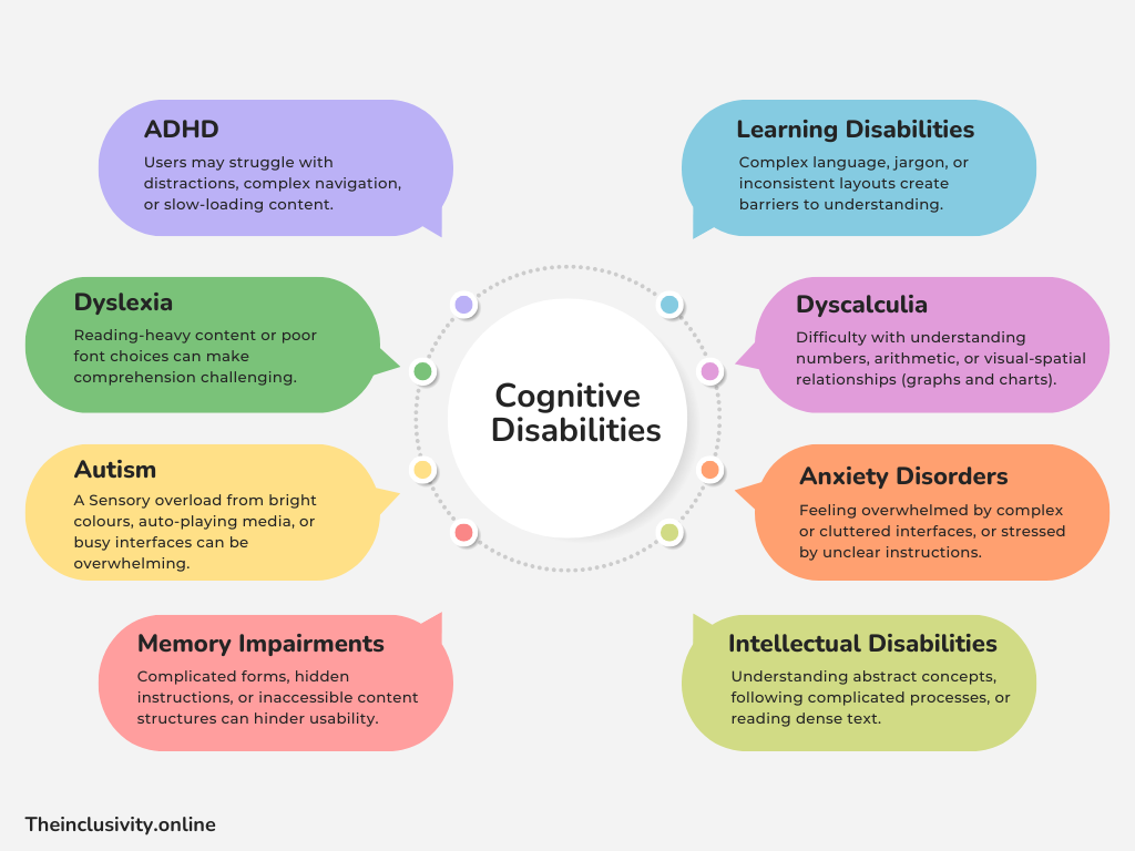
Here’s a big number to consider: neurodivergent users make up roughly 20% of the population. That’s one in five people. And since 96% of disabilities are invisible, challenges like ADHD, autism, and memory impairments often go unnoticed.
So, how does this shape your web design? It’s simple: whether you see it or not, neurodivergent users are part of your audience.
Let’s dive into how to make your site not just accessible, but truly user-friendly for all kinds of brains.
Design Guidelines for Cognitive Accessibility: No Fluff, Just What Works
Cognitive accessibility is about making things easy. Not “kind of easy” or “we tried,” but actually easy for everyone, and spoiler alert: when you simplify things for these groups, you make it better for everyone else, too.
We’re designing for humans, not robots. Overwhelming interfaces, impossible navigation, and vague instructions are barriers, not features. Here’s how to do better:
1. Keep It Simple, Not Boring
Cognitive disabilities often mean that users struggle with processing complex layouts or excessive information. Your goal? A clear, straightforward design that doesn’t overwhelm.
- Minimize Clutter: Use plenty of white space to give breathing room.
- Prioritize Information: Highlight the most critical info first. Think bold headlines, short subheadings, and bullet points that get to the point.
- Include summaries for long documents: A sidebar or top summary highlighting key takeaways can help.
Tip: Instead of dumping a wall of text about your new product, break it into digestible chunks with visual separators.
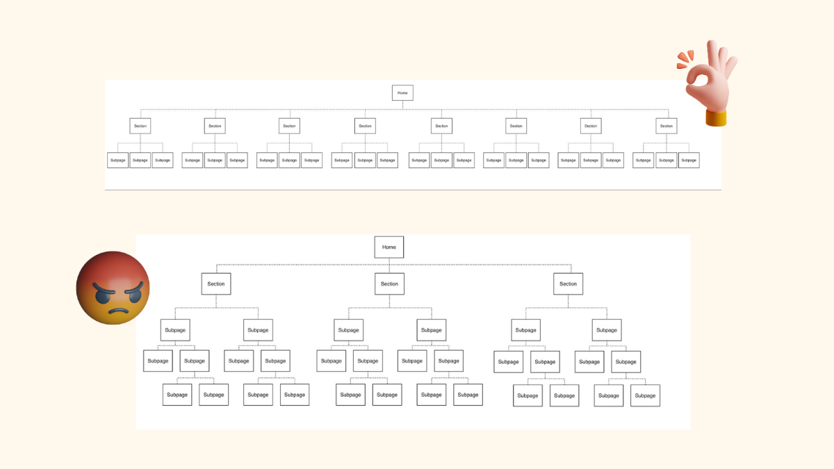
2. Navigation Should Be a No-Brainer
- Consistent Menus: Place menus where users expect them, and keep them consistent across pages.
- Descriptive Labels: “Learn More” is vague. How about, “Learn About Pricing Options”?
- Breadcrumbs: Users can backtrack easily without feeling stuck in a maze.
- Avoid dropdown inception: Submenus of submenus? Hard pass.
- Navigation: Limit the main menu to 5-7 items as the core categories.
Tip: Nielsen Norman Group: “The deeper a hierarchy becomes, the more likely visitors are to become disoriented.”
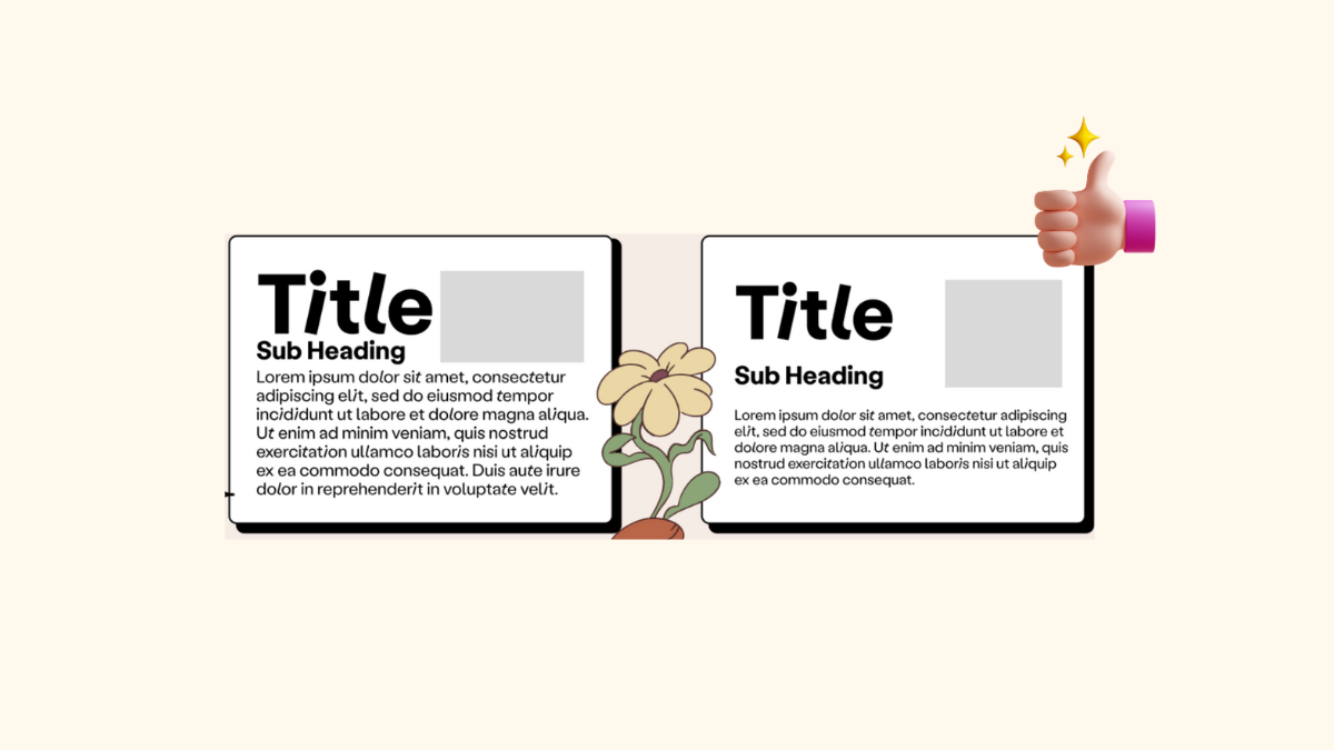
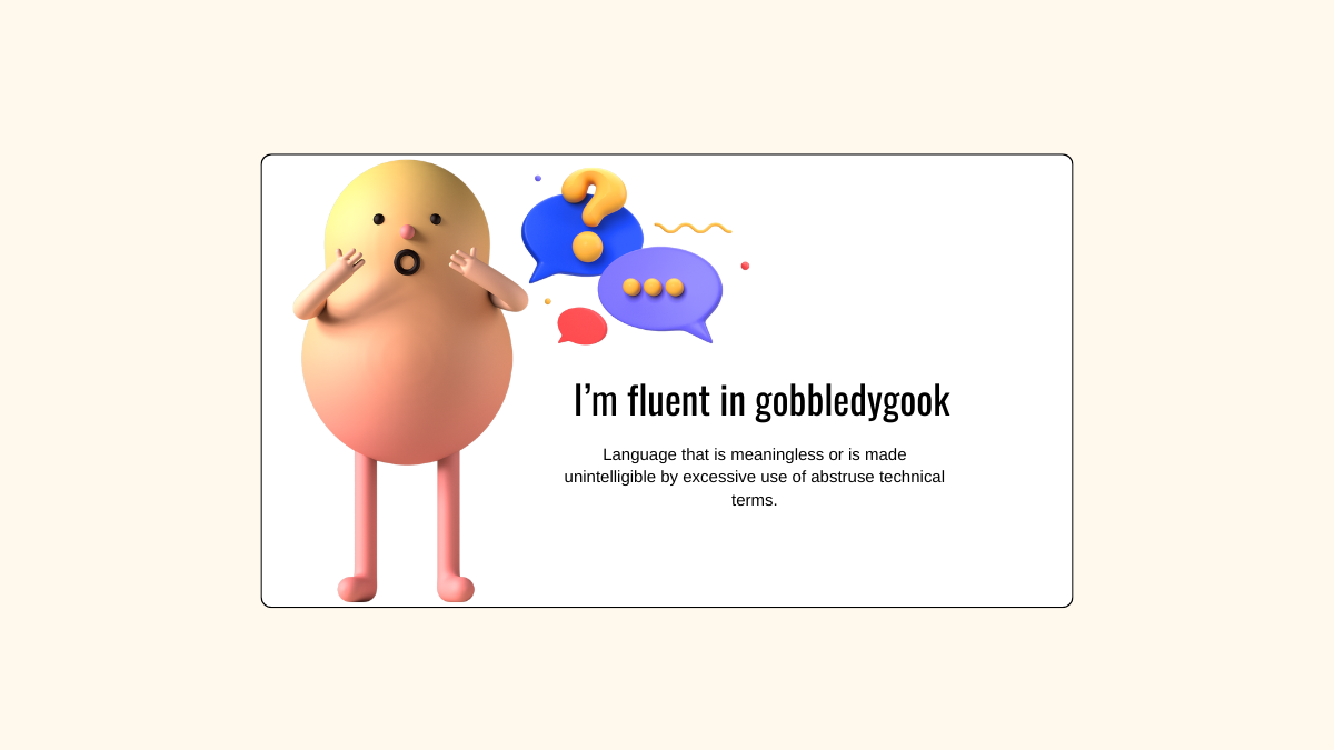
3. Plain Language, Please
Leave the jargon and corporate-speak at the door. Cognitive disabilities often make it harder to process complex language, so aim for clarity and relatability.
- Short Sentences: Break down big ideas into smaller, digestible pieces.
- Simple Words: Use words a 10-year-old would understand, unless your audience is rocket scientists.
- Define Uncommon Terms: If you must use technical language, explain it right there on the page.
Tip: After writing, read your content aloud like you’re explaining it to someone over coffee. If you trip over words or have to pause to clarify, it’s too complicated
4. Visual Support for the Win
Words alone don’t always cut it. Combine text with visuals, audio, or interactive elements.
- Icons and Images: Pair text with visuals to reinforce your message. Just make sure the images are meaningful, not decorative fluff.
- Infographics: Simplify data-heavy content into easy-to-follow visuals.
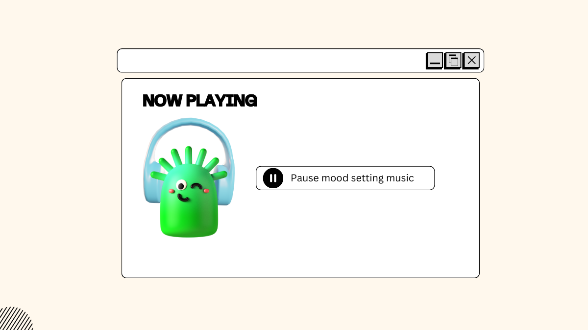
Tip: Adding a quick “How it works” video to your FAQ page or using icons alongside text to explain steps.
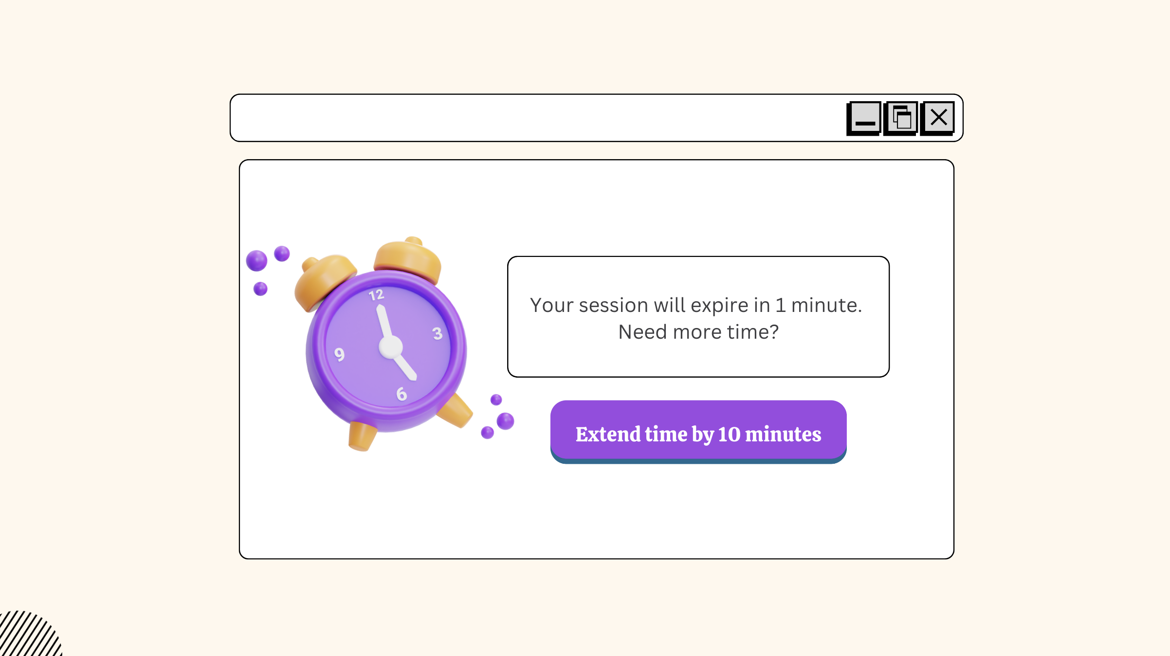
5. Give More Time
Some users may need extra time to read, think, or respond. Don’t rush them.
- Avoid Auto-Advancing Content: Allow users to pause or snooze animated content.
- Adjustable Time Limits: If your site has forms or quizzes, give users options to extend time limits.
Tip: Instead of locking someone out after five minutes, offer a warning like, “Your session will expire in 1 minute. Need more time?” with a prominent “Extend” button.
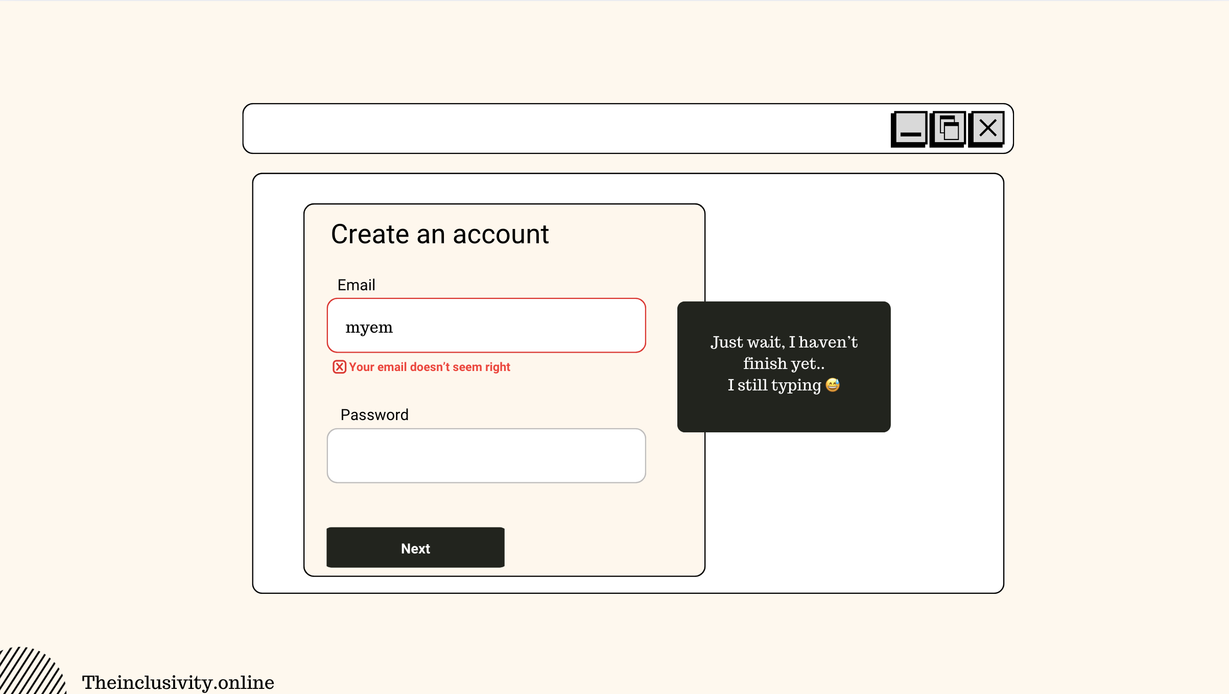
6. Help Users Fix Mistakes
For users with cognitive disabilities, unclear actions or irreversible mistakes can be even more frustrating. Everyone messes up, don’t punish them for it.
- Add back buttons.
- Let people undo mistakes.
- Use inline validation: show errors where they happen, not 10 steps later.
Tip: When using real-time validation, do it after the user has focused on another field.
7. Cut the Memory Work
Making users memorize steps or recall obscure passwords? That’s lazy design.
- Use password managers, and magic links for login and allow copy-and-paste functionality.
- Provide instructions upfront, not buried in another page.
- Provide one-step login options (e.g., sign-in via social media or biometric authentication).
Tip: In forms, include tips like “Your password must include at least one number and one symbol” right by the input field. Don’t make users guess, or worse, find out after they’ve already typed and have to start over.
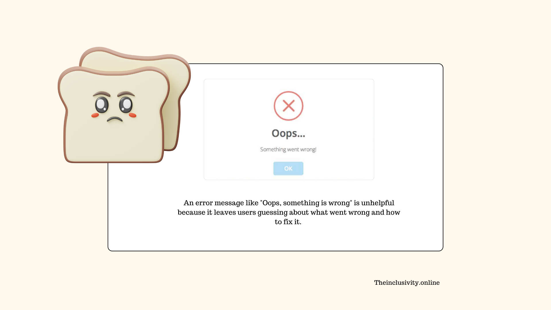
8. Provide Immediate Feedback
Nobody likes staring at a blank screen wondering if their button click even registered.
- Use confirmation messages: “Your form has been submitted.”
- Error messages should tell people what went wrong and how to fix it, don’t just say “Invalid input.”
Tip: A file upload tool that says, “File too large. Try one under 2MB” is much better than “Error 403.”
9. Kill the Distractions
When users struggle with cognitive overload, distractions can feel like an ambush. For neurodivergent users or anyone with attention difficulties, simplicity isn’t just nice, it’s essential.
- No autoplaying videos, audio or carousels.
- Ads? Fine, but keep them out of people’s faces.
- Simplify interfaces by removing elements like endless scrolling feeds or busy animations.
Tip: Keep interactive features purposeful and calm, no one needs a random social media feed stealing focus.
10. Styling and Readability
Cognitive challenges often impact how users process and interact with visual information. Overly complex designs or unconventional layouts can create unnecessary frustration.
- Avoid using ALL CAPS as much as possible. These can be harder to read, particularly for neurodivergent users.
- Allow users to customize the display of content, including turning off colours or images, to suit their preferences.
- Stick to the familiar, and use standard web components and layouts that users intuitively understand.
- Choose dyslexia-friendly fonts like Arial or Verdana.
Tip: Keep line lengths short, ideally 50-75 characters per line. This improves readability and makes scanning content easier for users with cognitive difficulties.
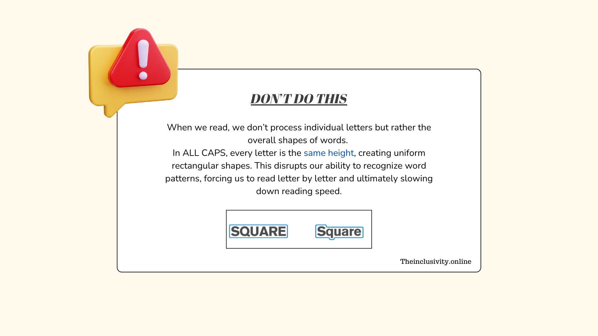
Usability expert Jakob Nielsen has found that reading on screen can be around 25% slower than reading from paper, and reading All Caps can be a further 10% slower.
Tips for Drawing Attention
Blank Space: Surround key content with blank space to make it pop.
Color: Use contrasting colours to emphasize important elements.
Frames Matter: Box it, circle it, outline it. Just make the important stuff stand out.
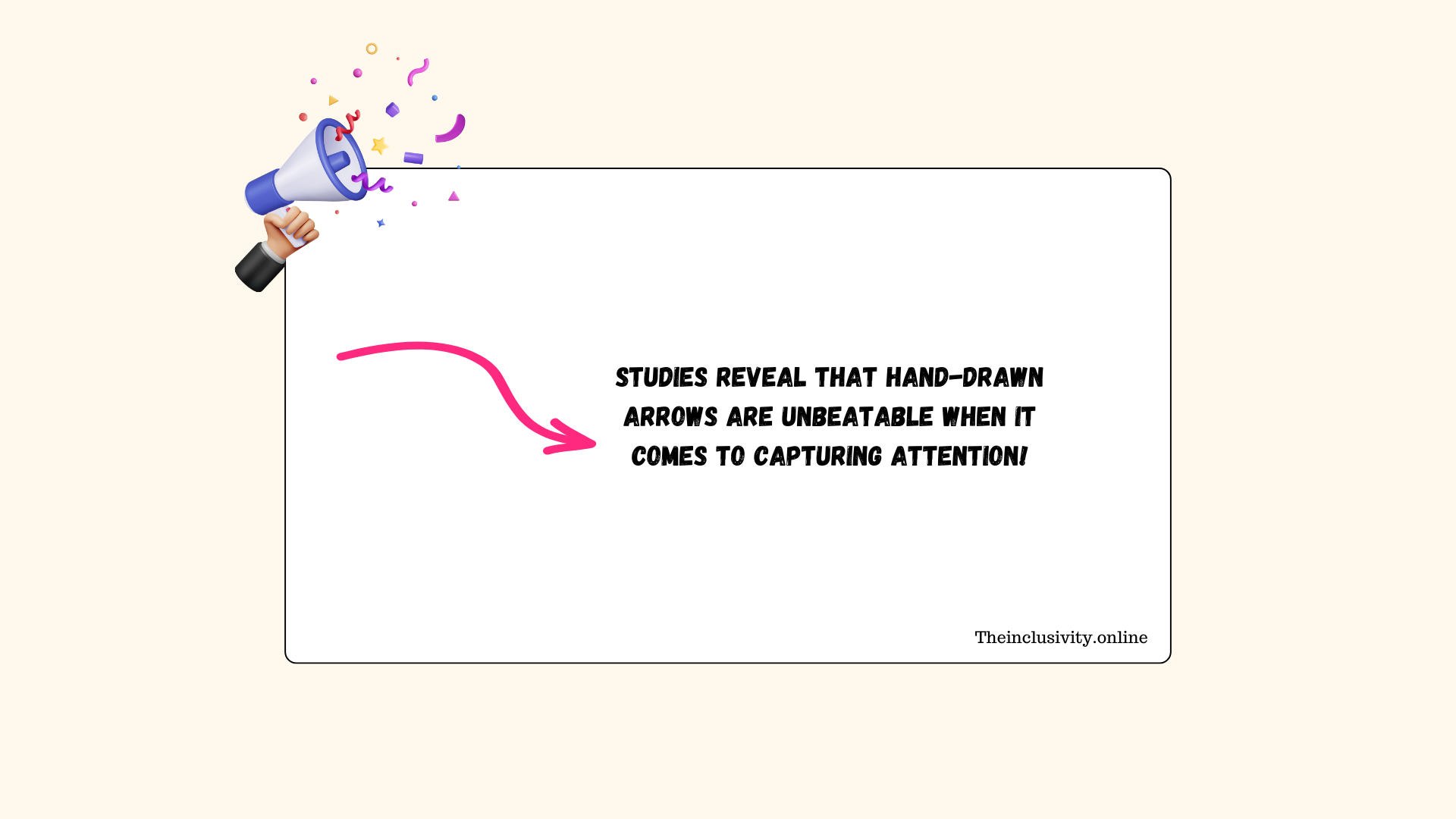
Point It Out: Add arrows or visual cues pointing to the key information.
Guidelines: Use lines or paths to lead the user’s eye toward focal points.
Positive Feedback: Use positive reinforcement messages, such as “Great job!” when tasks are successfully completed.
Big, Bold Headers: If it’s important, make it look important, and use real headers in the code.
Keep it Short: Write concise, impactful headers and phrases.
Punctuation Power: An exclamation point or a question mark can punch up your message. Use them wisely.
Bold Text: Highlight key ideas with bold font, especially at the start of sections.
Summaries: Place the main idea upfront for easy scanning.
Remember, screen readers aren’t just for users with visual impairments, they’re game-changers for people with intellectual disabilities or reading challenges too.
Bringing It All Together
Designing for cognitive accessibility isn’t just about following rules, it’s about empathy. It’s recognizing that no two brains process information the same way and building spaces where everyone feels comfortable, respected, and empowered.
The beauty of these principles? They don’t just help users with cognitive disabilities, they improve the experience for everyone. Because who doesn’t love a clear, easy-to-navigate website?
Soon, I’ll dive into WCAG criteria specifically tailored to benefit cognitive accessibilities. Stay tuned!