Product cards are the gateway to your store. If your product cards aren’t accessible, the entire shopping experience falls apart for keyboard users, screen reader users, and anyone with low vision.
In this teardown, I’ll show how a single, great-looking card hides over 10 issues that quietly block real customers from shopping. These aren’t minor flaws. They break the flow, kill trust, and cost sales.
Table of Contents
Test Scope
Component: One product card
Tested for: Keyboard flow, semantic markup, screen reader output, form labelling, and link behaviour
Accessibility Barriers & Sales Blockers
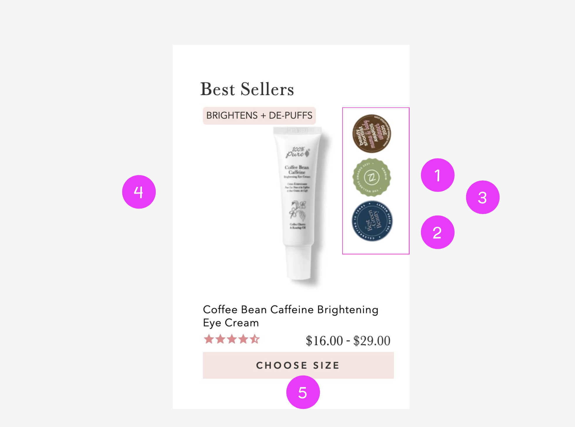
1. Multiple Links Going to the Same URL
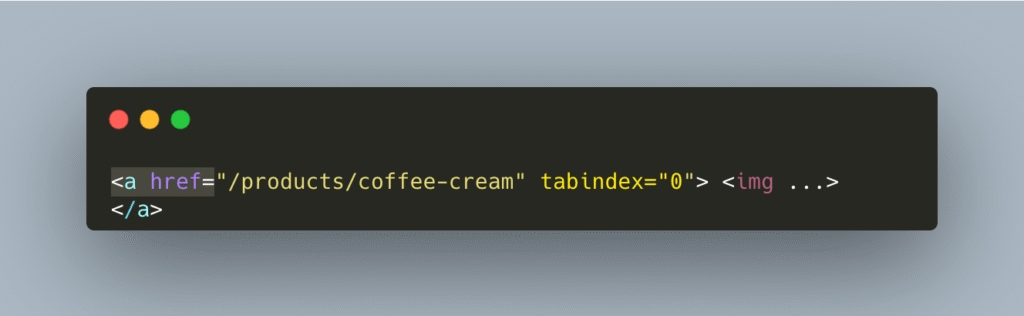
This is repeated four times.
Problem:
Every one of those featured image badges links to the exact same product page. That’s a keyboard trap, a screen reader time-waster, and a tab key nightmare.
Why it matters:
- Keyboard users must tab through the same link 4x
- Screen readers announce “link, Featured” 4x
- This clutters the DOM and kills the shopping flow
Fix: One meaningful link per destination. Remove the rest.
2. Vague alt=”Featured” on Every Badge
Every badge says the same useless thing.
<img alt="Featured">Problem:
“Featured” doesn’t tell you anything. What’s being featured? Is it an award badge, a top-seller, a clean-beauty label?
Why it matters:
- Screen reader users don’t know what is featured
- It’s meaningless. Missed chance to build trust
Fix: Replace with useful alt text like: alt="Allure Best of Beauty 2023 badge"
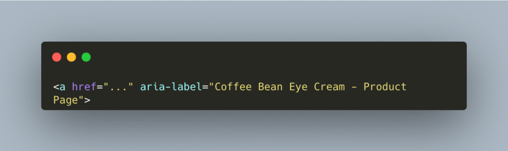
3. Meaningless Link Text
<a href="..."><img alt="Featured"></a>Problem:
Links need meaning. Screen readers just hear “link, Featured” multiple times.
Why it matters:
- Screen readers will announce “link, Featured” four times.
- It fails the WCAG requirement for clear link purpose
- These links are functionally meaningless without context.
Fix: Use aria-label or wrap images in contextually clear links like:
4. Tabindex Spam
They’ve slapped
<a href="..." tabindex="0">...</a> on every <a>, even duplicates, making the whole card a tab hellscape.
Why it’s a problem:
- Adds fake tab stops everywhere
- Buries important actions (like Add to Cart) in noise
- Keyboard users give up ( I would)
Fix: Remove tabindex="0" from anything that’s already focusable or repeated.. Only add tabindex="0" when necessary.
5. Fake Button Made with SPAN
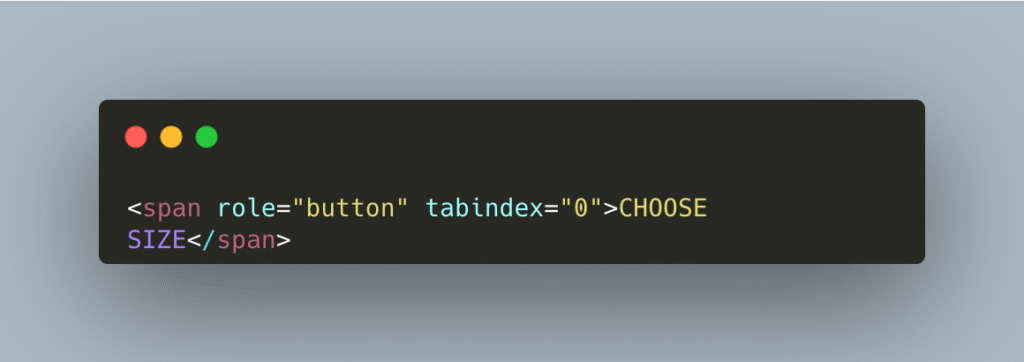
Why it’s a problem:
This is a <span> pretending to be a button. That’s fake semantics, and it fails on:
- Keyboard interaction (Enter/Space may not trigger it)
- Screen readers may not recognize it
- Not a real button = no native behaviour
Fix: Replaced fake <span> buttons with real <button> elements for keyboard and screen reader support.
6. Messy Form Layout
The layout mixes hidden inputs, spans, and fake buttons with no clear flow.
Problem:
They’re mixing form elements, fake buttons, and non-obvious interactions in a messy layout. It’s not clear when the product is selected or what action happens after.
- Users don’t know what’s clickable or what changes.
- The “Choose Size” flow is confusing.
- Forms feel broken or unpredictable
Fix:
- Use real form elements
- Label every input with a visible label or
aria-label - Group related actions clearly
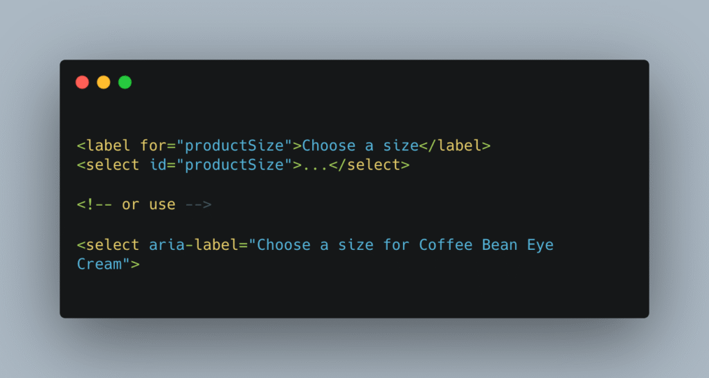
7. No Label on Dropdown
The size selector has no visual or screen reader label.
Why it’s a problem:
- Users don’t know what they’re choosing
- “Select” what? For what product?
Fix:
8. Star Ratings Hidden from Assistive Tech
The rating is visual-only. Markup uses aria-hidden="true" on the icons.
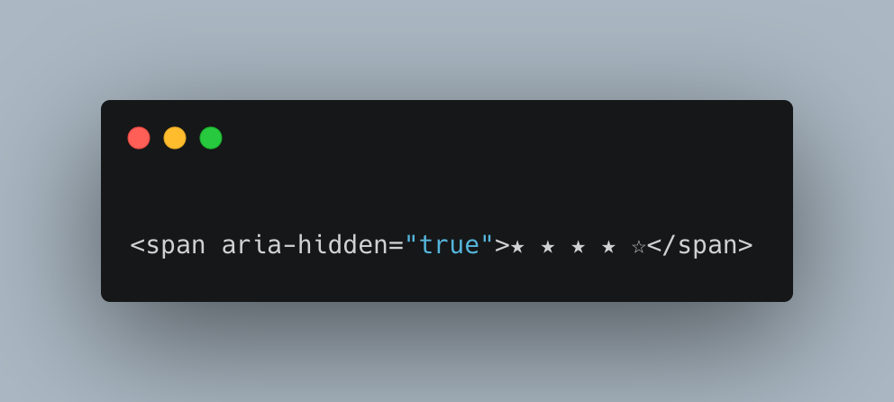
Why it’s a problem:
- Screen readers can’t hear the rating
- Ratings build trust. If users miss them, they hesitate
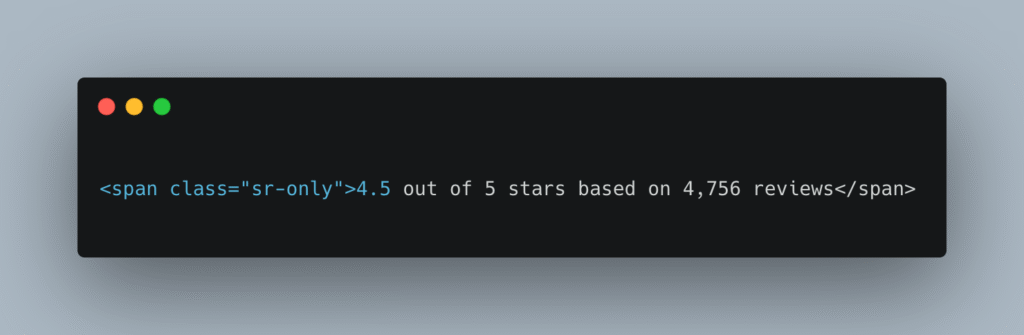
Fix:
Add a hidden span that will be announced only for screen readers with the full sentence and associate it with the rating container.
9. Broken Focus Order
Focus jumps around randomly. Badges and images get focus before the Add to Cart button.
Why it matters:
- Users get lost
- They may never reach the Buy button
Fix: Clean up the DOM and remove non-essential focusable elements.
10. Poor Contrast Over Images
Some prices and badges are styled with low-contrast text over busy images.
Why it matters:
- Low vision users can’t read pricing or product info
- You lose customers who want to buy, but can’t read the details
Fix:
Meet at least 4.5:1 contrast. Use solid backgrounds under text.
Recap: Every Issue Hurts Sales
| Barrier | What Happens | What It Costs You |
|---|---|---|
| 4 duplicate links | Keyboard users get stuck | Lost sales from cart abandonment |
| Fake buttons | No keyboard access | People can’t choose size, no sale |
| No alt text | Screen reader users miss info | Trust breaks, users bounce |
| Ratings hidden | Blind users can’t judge product | Low conversion, higher return risk |
| No focus styles | Users get lost | Store feels broken, they leave |
Quick Fix Wins:
- Killed 4 duplicate product links = 75% fewer tab stops.
- Cleaned up repetitive “Featured” alt text = clearer screen reader context.
- Removed tabindex spam = smoother keyboard flow.
- Swapped fake buttons for real ones = working interaction
For more on building inclusive e-commerce, check out W3C’s Inclusive Design Guidelines
Why Accessible Product Cards Matter for Sales and UX
If even one shopper can’t use your store smoothly, that’s one lost sale. Multiply that by thousands. These issues don’t just hurt usability; they quietly kill conversions.
See real-world examples of accessibility improvements in my Case Studies