E-commerce stores often look polished, but small accessibility mistakes quietly cost sales and frustrate customers. From confusing forms to hidden navigation hurdles, many online shops unintentionally block potential buyers, particularly those relying on assistive technology.
Most issues are simple to fix, and addressing them improves trust, readability, and conversions. Each barrier you remove gives users a fair shot at engaging with your site, boosting both usability and loyalty.
Avoid these common accessibility mistakes to improve your customer experience.
5 Accessibility Mistakes That Quietly Kill Sales
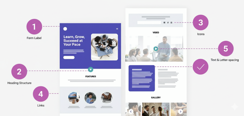
1. Forms Missing Labels
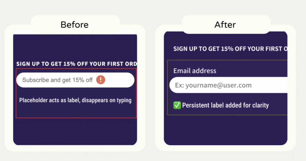
Problem: Email fields, checkout inputs, or newsletter forms sometimes rely only on placeholders. Screen readers can’t clearly announce what the field expects.
Fix: Add visible labels or aria-labels.
Impact: Don’t use placeholders as labels. They vanish when users start typing, forcing them to remember what the field was for a pointless memory test. That confusion drives form abandonment, especially on mobile.
For store owners, this means fewer newsletter signups and less trust. Clear, persistent labels reduce friction and make your form look polished and reliable.
2. Misused or Skipped Headings
Problem: Decorative headings or inconsistent hierarchy make content hard to navigate and reduce SEO clarity.
Fix: Apply a proper heading structure (h1–h6) that reflects content importance.
Impact: When headings jump levels or repeat the same text, screen readers can’t map the page. Users lose context and navigation flow.
For store owners, that’s like hiding your store’s aisle signs. Customers get lost, frustrated, and leave before converting. A logical heading hierarchy builds trust and makes scanning easier for everyone.

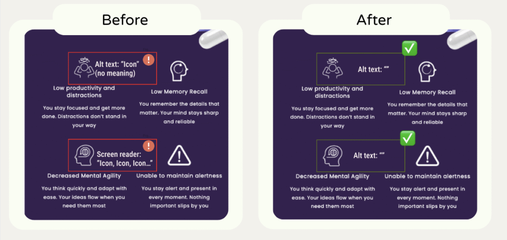
3. Meaningless Alt Text on Icons or Images
Problem: Alt text like “icon” or empty attributes provide no information to screen readers.
Fix: Use descriptive alt text that conveys purpose or meaning.
Impact: Alt text like “icon” or “image” adds noise, not value. When the text next to the icon explains enough, the image doesn’t need alt text. It just repeats information and slows navigation for assistive tech users.
For store owners, this clutter distracts from what matters: helping shoppers decide to buy. Keep alt text for content that sells the benefit or product; skip it when it’s purely visual. Every unnecessary word is friction.
4. Tightly Spaced Text
Problem: Tiny fonts or negative letter-spacing strain users’ eyes and cognitive load.
Fix: Increase font size and adjust spacing for readability. Don’t use negative values.
Impact: Overly small or cramped text strains the eyes and forces users to zoom. It’s not just about accessibility, it’s readability. For store owners, poor typography signals low-quality design and hurts credibility. Fixing it improves scanning, comprehension, and overall time on page, all signals that boost conversion.

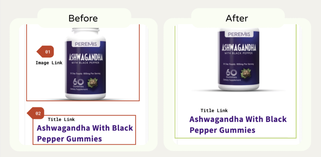
5. Duplicate or Adjacent Links
Problem: Multiple links pointing to the same URL slow down keyboard and screen reader navigation.
Fix: Remove redundancy or merge links.
Impact: Multiple links pointing to the same page clutter the tab order and confuse assistive tech.
For store owners, that means users spend energy guessing where to click instead of buying. Clean, consolidated links streamline navigation, reduce frustration, and make your site feel more professional.
Most accessibility mistakes hide in plain sight. Every small fix you make removes a barrier between your brand and your next paying customer. Accessibility isn’t about compliance; it’s about clarity, predictability, and trust.
Want to see real before-and-after examples? Visit my Case Studies page.