Struggling with accessible form instructions? You’re not alone. Most forms talk to users. Bad ones leave people in the dark — literally.
Table of Contents
Real fix for a real issue that’s costing shops sales
Ever tried to fill out a form and had no clue what the inputs were for?
People using screen readers (blind, low vision, or deaf-blind users) rely on the code structure, not just what’s on screen.
If accessible form instructions aren’t coded right, screen reader users won’t hear them at all.
This makes the form confusing and error-prone. Users will leave. Simple as that.
What This Breaks for Shops:
- Blocked signups = fewer customers
- More support tickets = wasted time
- Legal risk = fines under AODA, ADA, more
- Frustrated users = broken brand trust
This specific mistake is quite common, appearing in 7 out of 10 signup or checkout forms audited, even on major platforms.
According to WebAIM’s form guide, unlabeled or disconnected form instructions are one of the top accessibility barriers.
A common example
Imagine this: You’re signing up, but you can’t see the screen. Your screen reader says:
Password: [input]. Re-enter password: [input].
But it doesn’t say you need to match them.
You submit. You get an error. You try again. Same thing.
Would you keep trying or bounce?
How I Fixed the Accessible Form Instructions
👎 Before (bad for screen readers):
    <p>Password fields must match</p>

    <label for="password">Password:</label>
    <input type="password" id="password">

    <label for="password2">Re-enter password:</label
    <input type="password" id="password2">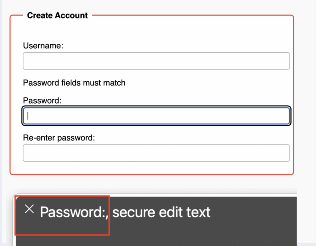
Here, Assistive tech (VoiceOver) skips the instructions completely. It’s not connected to the password fields in any way.
👍 After (screen reader-friendly):
Here’s how the same form goes from broken to accessible, and no design changes are needed.
    <p id="mustmatch">Password fields must match</p>

    <label for="password">Password:</label>
    <input type="password" id="password" aria-describedby="mustmatch">

    <label for="password2">Re-enter password:</label>
    <input type="password" id="password2">
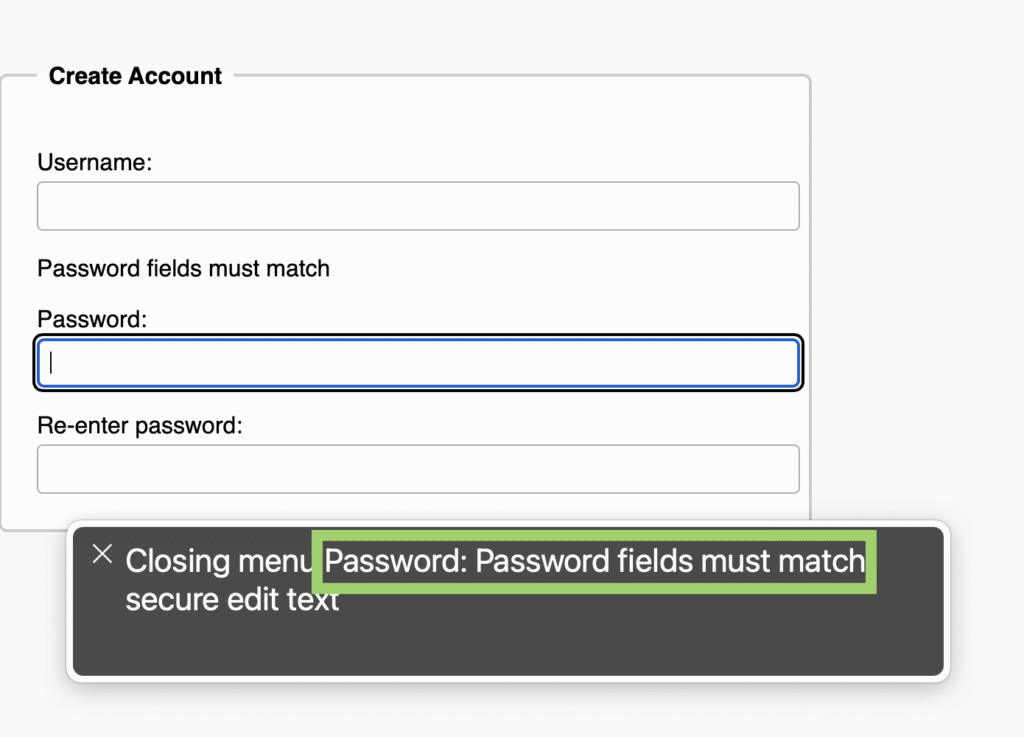
By adding aria-describedby to the first field, we connect the instruction text. Now screen readers will announce it at the right time.
The Rule Behind It
WCAG 2.2 – Success Criterion 1.3.1: Info and Relationships
If it looks connected, it should be coded that way too.
In everyday words:
If your form shows something important with layout, colour, or text, make sure that same info is in the code.
Because if it’s not, screen readers miss it completely.
This kind of issue slips right past dev teams. But for people using screen readers, it’s a roadblock.
It’s like putting up a warning sign in plain sight but making it invisible to the people who actually need it.
The Real-World Impact
Better accessible form instructions mean
- Faster signups
- Less form abandonment
- Improved compliance
- More people able to use your site without help
“Over 15% of the world’s population lives with a disability. That’s a lot of missed carts.”
If you want to make your website more inclusive, check out my case studies