I audit e-commerce sites for a living. The most common e-commerce accessibility failure I find has nothing to do with colour contrast or missing alt text. It’s a hover.
Specifically, interactions that only fire when a mouse is involved:
- Menus that open on
mouseover - Quick View buttons that appear only when the cursor moves across a product card
- Colour swatches that preview the product image on hover and do absolutely nothing on focus
Every one of those is an invisible wall for anyone not holding a mouse.
According to the Return on Disability Group’s 2024 report, people with disabilities and their families control over $18 trillion USD in annual disposable income globally. The Click-Away Pound Survey found that 71% of people with access needs will leave an inaccessible website rather than ask for help. They don’t file complaints, they don’t email support, they just leave. For a store doing $60K a month in revenue, losing 10% of potential customers before they reach the product page is a $6,000 monthly problem nobody flagged in QA.
Here is where that money goes.
Table of Contents
Quick View Buttons
A personal favourite to audit because the failure is so visible once you see it. The button is styled to opacity: 0 and made visible on mouseover of the product card. Tab to the card, and the button receives focus, but you can’t see it.
The element is there, it’s focusable, and it’s completely invisible to anyone navigating by keyboard. I’ve watched screen reader users Tab through product grids, activating Quick View buttons they had no idea existed, because nothing told them they’d landed on something interactive.
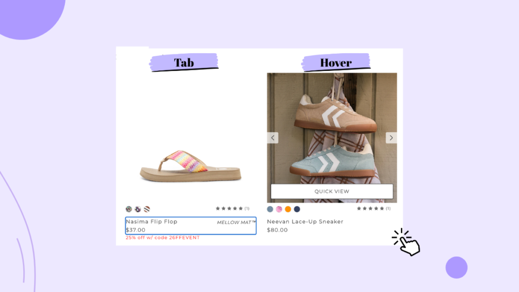
Fix: use:focus-within in CSS to show the button whenever the card or any element inside it receives focus. Alternatively, toggle visibility via onfocus in JavaScript. Either way, if the element is reachable, it needs to be visible.
Colour Swatches
You’ve built a product page where hovering a swatch previews the product in that colour. It’s a nice feature for mouse users. For keyboard users, Tab moves focus through each swatch and the image never changes.
The issue is binding the image update only to mouseover. The same update needs to fire onfocus. That’s one word added to an existing event listener. The number of stores that haven’t done this, across products where colour selection materially affects the purchase decision, is genuinely surprising.
Navigation Menus
The most common version: a mega menu that opens on mousehover. Tab to a top-level nav item and nothing happens. The submenu exists, but the keyboard user has no way to reach it.
I’ve tested this on stores with hundreds of product categories where the only navigation path was hover-triggered. A keyboard user literally cannot browse the catalogue. That’s not a minor friction point; that’s the store being functionally closed to them.
Fix: add onfocus or a keydown listener to the parent nav item so the dropdown opens on keyboard activation. Add an Esc handler to close it. Both are single-line additions to existing code.
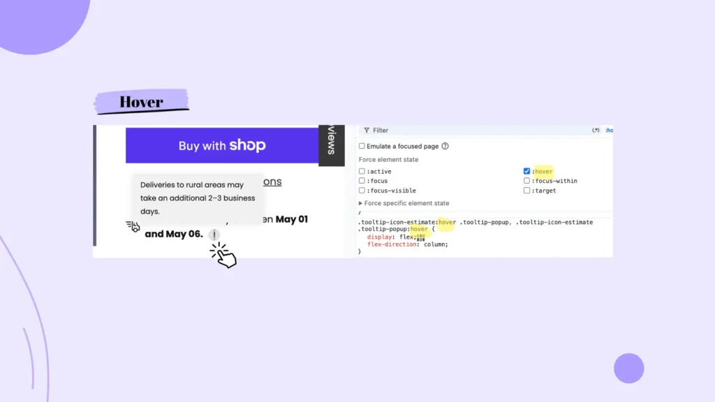
Tooltips and Info Icons
Shipping estimates. Sizing guides. Material care instructions. All of it sitting behind mouseover-only tooltips scattered across product pages.
Tab to an info icon. Does the tooltip appear? On most implementations: no. That information is simply unavailable to anyone not using a mouse. For a store where the sizing tooltip is the difference between adding to cart and leaving, that’s a direct conversion cost.
Fix: trigger the tooltip on focus, keep it open long enough for a screen reader to announce the content, and add an Esc handler to dismiss it. If the tooltip contains critical purchase information, consider whether it should be visible by default rather than hidden behind an interaction at all.
Product Filters
Tab to a filter dropdown. Press Enter or Space. Can you expand it? Can you arrow through the options?
On stores using custom-styled filter panels, which is almost all of them, the answer is usually no. The filter opens on click and has no keyboard handling at all. A keyboard user in a clothing store with 200 products and no working size filter is browsing an unsortable catalogue. Most of them won’t stay long enough to find out.
Fix: add keydown handlers for Enter and Space to open the filter panel, and arrow key navigation for the options inside. Native <select> elements handle all of this without any scripting, which is worth knowing next time a designer wants a custom-styled dropdown.
Sale Banners and Pop-ups
This one tends to surprise people. Promotional banners that trigger on mouse movement or exit-intent pop-ups that fire when the cursor approaches the browser chrome never appear for keyboard users. The trigger condition never fires.
If the banner carries a discount code, every keyboard user who completes a purchase misses the offer and pays full price. If it’s a time-sensitive promotion, they never saw it existed, and that’s an e-commerce accessibility gap that shows up directly in your revenue.
Fix: replace the mouse-movement trigger with a time-based one; most pop-up apps support this in settings, no code required. If the promotion is important enough to show, a persistent announcement bar at the top of the page means every user sees it, regardless of how they’re navigating.
When a pop-up does appear, there are two additional failures that show up constantly.
- The first: focus doesn’t move into the pop-up when it opens. The dialogue is visible on screen, but keyboard focus stays wherever it was, buried in the page behind it. A keyboard user has no way of knowing that something appeared, and a screen reader user gets no announcement. The pop-up exists for mouse users only, even when it’s technically visible to everyone.
- The second: the Escape key does nothing. Every modal, dialogue, and pop-up should be dismissible by keyboard. Escape is the expected key and users expect it instinctively. When it doesn’t work, the only exit is a mouse click on the close button. For a keyboard user, that pop-up is now permanent.
Fix for both: when the pop-up opens, move focus to the first interactive element inside it or to the dialogue container itself if it has tabindex="-1". Add an Escape key listener to close it. Two additions to whatever script is already managing the pop-up’s show/hide logic.
Custom Checkboxes and Radio Buttons
Let’s call what they are: Fake inputs.
A <div> or <span> styled to look like a checkbox with a click handler attached. Tab to it and press Space. Nothing happens.
This shows up in size selectors, add-on options, and subscription toggles at checkout. The keyboard user reaches a required input they can’t activate. The purchase stops there.
The fastest fix is switching to real <input type="checkbox"> and <input type="radio"> elements. Native inputs handle keyboard interaction automatically and can be styled however you like with CSS. Rebuilding custom inputs with correct keydown handlers works too, but it’s more code to maintain for the same outcome.
Scroll-Triggered Product Grids
Lazy loading and infinite scroll are common enough that most developers don’t think twice about them. The issue is when the scroll trigger listens only for mouse wheel or touch scroll events and ignores keyboard-based scrolling.
Tab down through a product grid using Page Down or arrow keys. Does the next row of products load? On a meaningful number of stores, it doesn’t. The keyboard user hits the bottom of the initial load and the page stops. No more products, no indication that more exist.
The fix is either making sure the scroll listener handles keyboard-triggered scroll events, or using an Intersection Observer to detect when the last loaded element enters the viewport, regardless of how the user got there.
Test Your E-Commerce Accessibility Right Now
Put the mouse away. Tab through your own store from the homepage to checkout confirmation using only Tab, Shift+Tab, Enter, Space, and arrow keys. Try to browse a category, filter by size, select a colour, apply a promo code, and complete a purchase.
If you get stuck before the product page, you know where to start. If you make it to checkout and can’t activate the payment button, you’ve been quietly turning away keyboard users at the finish line this whole time.
Like this store is doing…
None of these fixes are rebuilds. Most are a single event binding that should have been there from the start.
If this is the kind of failure you’re finding in your own store, the pattern doesn’t stop at hover events. You can find more real-site e-commerce accessibility breakdowns in the case studies.