These are common accessibility issues I keep encountering across real digital products. Most aren’t dramatic. They’re the kind that slip through reviews and quietly degrade the experience.
Updated regularly as new patterns emerge.
Hidden State
Quick View Hidden on Focus
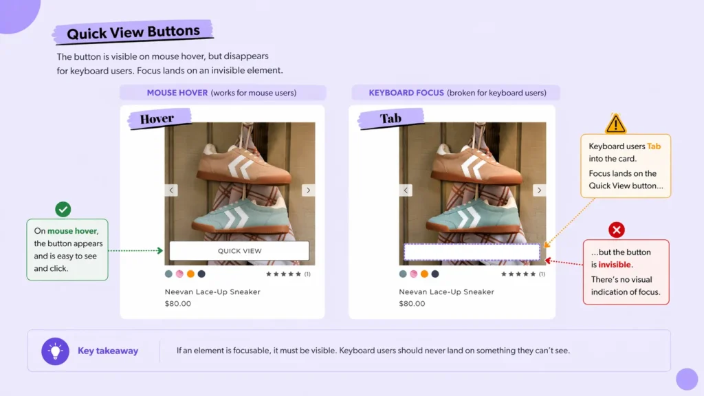
Focus lands on a Quick View control that stays invisible unless hovered. Keyboard users activate it without ever seeing it.
Open note
What happens
Quick View is set to opacity: 0 and only appears on hover.
What users experience
Tab lands on an interactive element with no visual target. Focus moves, nothing shows.
Why it happens
Visibility is tied to :hover. No :focus or :focus-within state.
Fix
Show the button on focus. Use :focus-within on the card or toggle visibility on focus. If it can receive focus, it needs a visible state.
Naming & Semantics
Unnamed Link in Product Slider
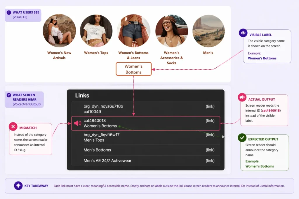
A focusable link has no accessible name. Screen readers announce the raw URL instead of the visible label.
Open note
What happens
While testing a featured product slider with a keyboard and VoiceOver, I encountered multiple product tiles that contain a clickable <a> element with no text content.
<span>Women's New Arrivals</span>

<a class="_link..." href="/ca/en/c/women/new-arrivals/...">
</a>
What users experience
Because the link has no name, screen readers announce “link” followed by part of the URL instead of the category name, including strings like “cat4840018.”
Why it happens
The visible label sits outside the anchor. The link has no accessible name.
Fix
Wrap the visible label inside the <a> and do not use empty anchors as click layers. Ensure each link has one clear accessible name derived from visible text.
<a href="...">
  <img alt="" aria-hidden="true">
  <span>Women's New Arrivals</span>
</a>
This is not a styling issue. It is a structural template problem that affects every instance of the component.
Hidden State
Megamenu Focus Lands Offscreen
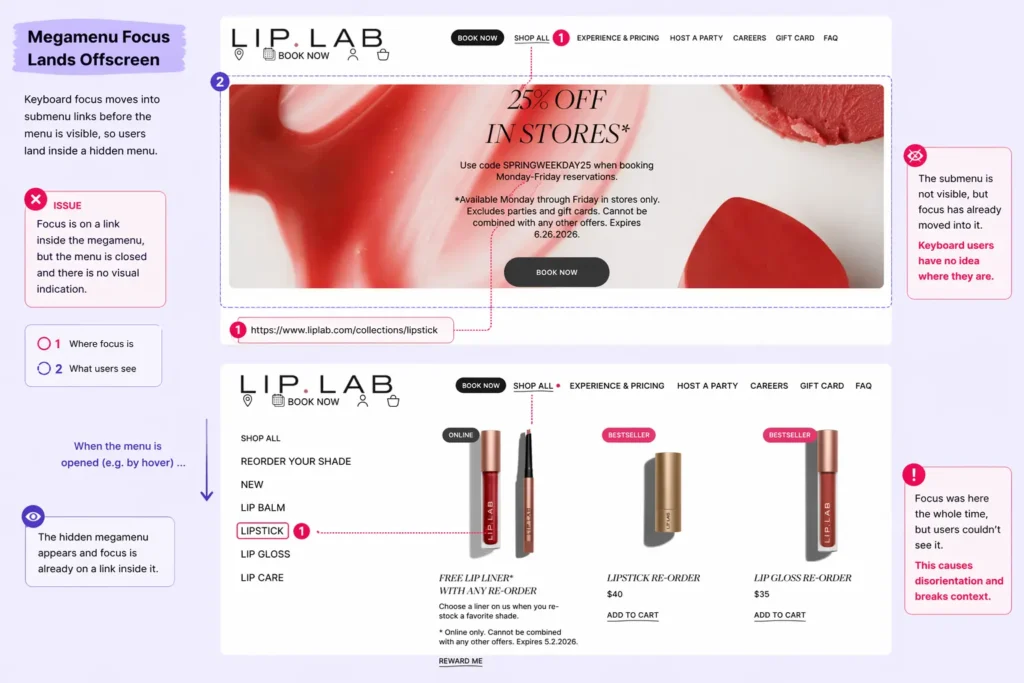
Focus moves into hidden submenu links, and keyboard users land inside navigation that isn’t visible.
Open note
What happens
Keyboard focus enters links inside a megamenu while the menu is still visually closed.
What users experience
Focus moves, but nothing appears on screen. Users navigate inside content they can’t see.
Why it happens
Menu visibility is tied to hover. Focus does not trigger the same open state.
Fix
Bind hover and focus to the same open-state logic. If focus enters the menu, the menu opens.
Interaction Logic
Tab Skips Size Selection
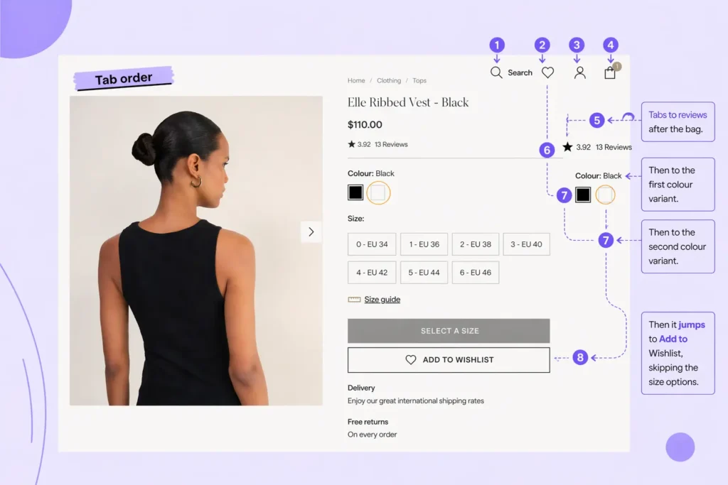
Size options are built with native radio inputs, but focus skips the group and jumps to the next control.
Open note
What happens
The size selector uses native radios, but keyboard users appear to skip from nearby controls to Wishlist without any visible stop inside the group.
What users experience
The size options are visible on screen, but the keyboard path into the group is unclear or missing. Users can miss a required selection and move on.
Why it happens
The radios are visually hidden and the visible labels do not expose focus clearly. If the group receives focus only once, with arrow keys required after entry, the interface gives no cue that focus arrived there.
Fix
Keep the native radio behavior, but expose focus on the visible label, group the options with fieldset and legend, and verify the keyboard path: Tab enters the group once, arrow keys move through sizes, and the current option is visibly indicated.
Do not use display: none, visibility: hidden, or tabindex="-1" on the radios
Hidden State
Tooltip Content Hidden on Focus
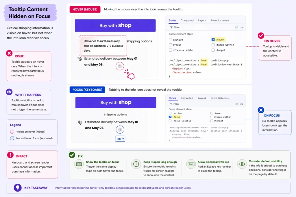
Critical product info sits behind hover-only tooltips, so keyboard users never access it.
Open note
What happens
Tooltips reveal content like shipping, sizing, or materials on hover only.
What users experience
Tab lands on the info icon, but no tooltip appears. The information is unavailable.
Why it happens
Tooltip visibility is tied to mouseover. Focus does not trigger the same state.
Fix
Show tooltips on focus, keep them visible while focused, and allow dismissal with Escape. If the content affects purchase decisions, don’t hide it behind interaction.
Interaction Logic
Swatches Don’t Update on Focus
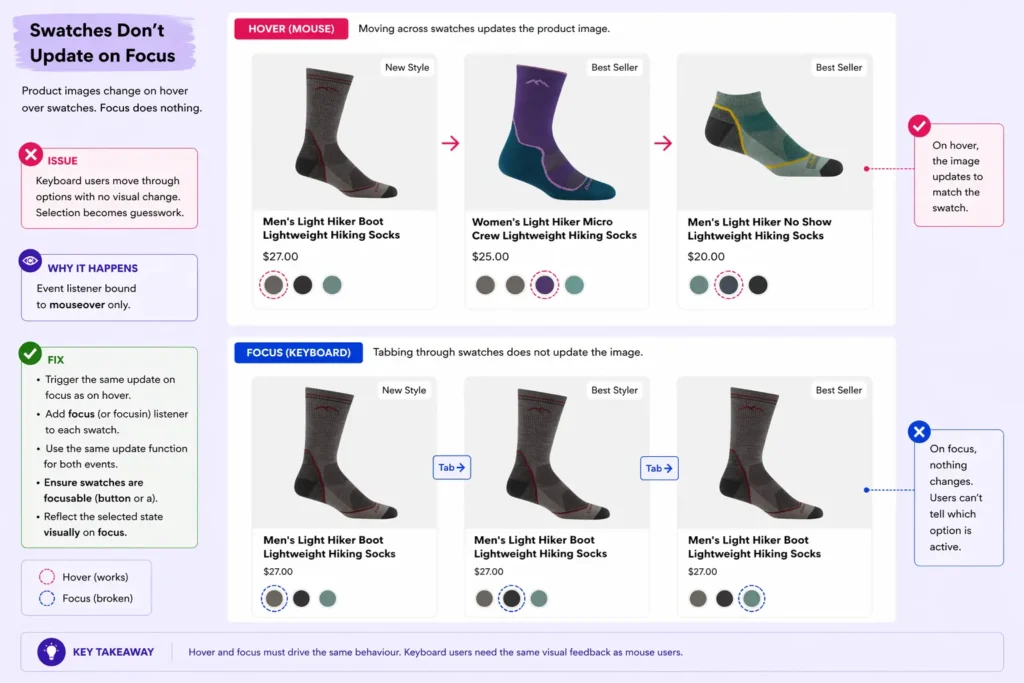
Images change on hover, not on focus. Users get no feedback.
Open note
What happens
Product images update when hovering over colour swatches. Keyboard focus moves through swatches, but nothing changes.
What users experience
Users navigate options with no visual feedback. The selected colour is unclear.
Why it happens
The image update is bound to mouseover only. Focus events are not handled.
Fix
Trigger the same update on keyboard focus.
- Add a
focus(orfocusin) listener to each swatch - Reuse the same function used for hover updates
- Ensure swatches are focusable elements (
buttonora, not plaindiv) - Mirror the selected state visually on focus
Interaction Logic
Pop-up Opens Without Focus
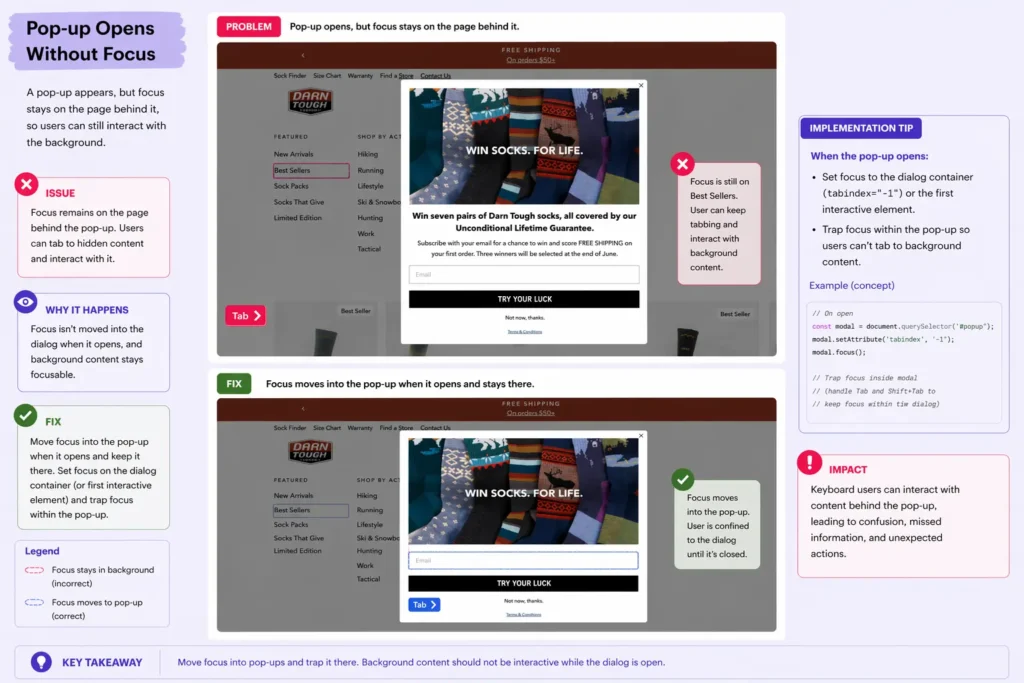
A pop-up appears, but focus stays on the page behind it, and users keep interacting with background content.
Open note
What happens
A modal opens visually, but keyboard focus remains on the underlying page.
What users experience
Users can keep tabbing through background elements instead of interacting with the pop-up. The dialogue is visible, but not active.
Why it happens
No focus is moved into the dialogue, and background content is not constrained.
Fix
Move focus into the dialogue when it opens and trap it there.
Set focus on the dialogue container (or first interactive element) and prevent tabbing to elements behind it.
Interaction Logic
Pop-up Can’t Be Closed with Keyboard
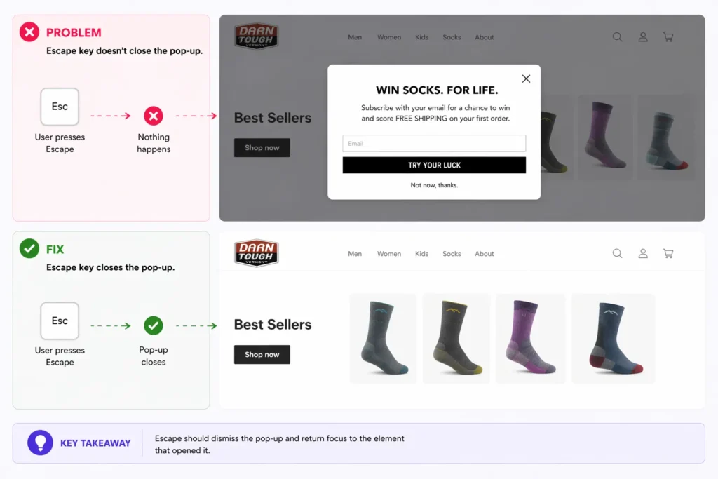
Pop-ups trap users because Escape doesn’t close them.
Open note
What happens
Dialogue opens but Escape key does nothing.
What users experience
Keyboard users can’t dismiss the pop-up.
Why it happens
No keyboard handler for dismissal.
Fix
Handle Escape at the dialogue level and close it reliably. Listen for Escape while the dialogue is open, trigger the same close logic used by the close button, and return focus to the element that opened the pop-up.
if (e.key === ‘Escape’) closeModal()